
Graphic designers are a bit like magicians. No one really knows exactly what we do or how we do it, but we get a slightly crazed look in our eyes and mumble under our breath a lot, then turn bits of stuff into things that look good.
We like being mysterious and enigmatic. It’s part of our charm. But in the interests of a happy client-designer relationship, I’m going to share a secret with you: when you ask us these 5 questions, we feel slightly dead inside.
- Can you make the logo bigger?
Of course I can make the logo bigger. The logo can be the size of an elephant if you really want. But I’ll counter your question with a question of my own: why do you want it bigger? Because I’d wager that, unless it’s the Nike Swoosh or the Maccas Golden Arches, your logo (as wonderful as it is and as much as you adore it) probably isn’t the single most important thing on that page that’s going to sell your product to your clients.
Whether we’re talking about your website or new brochure, chances are that once potential clients are viewing it, they’re not there for the logo. They’re on your site to look at your previous projects, or read your latest news posts, convincing them that you’re an expert in your field. They’re flicking through your brochure to see the stunning photography and read compelling copy that tugs on their heart strings and makes them yearn to work with you. Your logo isn’t going to achieve that on its own, and it certainly isn’t going to increase its chances by upping the dimensions.
Your high school girlfriend wasn’t lying when she said size isn’t everything. Bigger is not always better, and the bigger you make the logo, the smaller and less important other items on that page become.
Yes, brand identity is crucial to your business. Yes, your logo is an integral part of building brand recognition. And yes, your logo is great (well, we hope it’s great… if not, maybe it’s time for an update?)
Don’t get me wrong, I’m not anti-logo. I’m a designer – I love logos! Logos for everyone! Long live the logo! It just doesn’t need to be the focus of the entire design, that’s all.
- Why is it taking so long, can't you just copy-and-paste?
Um, no. That’s not quite what we do. Sure, we get you to write copy (the technical designer-y term for ‘words’) and then we copy-and-paste individual bits of wording into our working document, but that’s about the extent of our copy-and-pasting skills.
If we’re designing for print, we’re looking at typography, layout, page balance. We pay attention to line length, paragraph shape and even the space between individual letters (for real, it’s called kerning. This is why all your designer friends have OCD.)
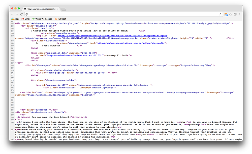
Designing for web is also highly finicky. Instead of me waffling on, check out the two screenshots below. The first shows this exact blog post, copy-and-pasted from the original word doc, directly into the interwebs with no other editing. Yuck. The second screenshot shows a tiny snippet of what this page ACTUALLY looks like behind the scenes… all the crazy code that makes it look the way it does (gorgeous, obviously).
So no. I didn’t go to university for 4 years to earn a Bachelor of Copy/Paste.
- Can you make this photo higher res?
In a nutshell (and yes, this is overly simplified for the purposes of this post), resolution is the number of dots per inch that make up an image. The dots are actually tiny coloured squares that when viewed at a distance look like beautifully smooth lines, shapes and gradients of colour, working together to create an overall image (like a jpeg). High resolution, which is required for printed material, is 300dpi. The number of dots in a jpeg image are finite – this means that once the image exists, you can’t just magically add more dots out of nowhere without the picture looking dodgy.
This is why you can make an image smaller and it’ll still look good, but enlarging is a different story. When you make the overall size of the image bigger, the original number of dots have to now fill up a larger space. Photoshop performs its wizardry, and it’s pretty clever at estimating what colour a new dot should be based on the dots around it, but it’s not perfect (sorry Photoshop. I still love you.)
Since we’re now creating new dots out of nowhere, as close as possible to what we think they should be, the subtleties of colour, pattern and shading start to look jerky and unrefined. This is what you know as pixilation – also called a crappy looking image.
So, even if an image looks great on your computer screen (screens have a lower resolution than print), it doesn’t guarantee it’ll look any good in print. Your friendly neighbourhood designer will be able to tell you the maximum print size of an image… but they won’t be able to make it any larger without compromising quality, sorry.
- Oh, is your computer not a touchscreen? *Swipes dirty fingers all over screen*
No. No, my very expensive custom built Mac is not a touchscreen. Please stop smearing finger grease all over it.
It breaks my heart a little every time someone goes in for the kill on my screen. And I can’t even count the number of times I’ve tried to Photoshop a mark out of an image, only to discover it’s actually someone’s fingerprint. So please, please don’t touch it anymore or I might cry.
- I get what you're saying, but can we just make the logo slightly bigger?
Stop it. Seriously.